The design industry has become conditioned to follow trend reports of the color powerhouse, Pantone Color Institute. Without fail, Pantone provides insight, inspiration and an ever expanding library of sophisticated colors for designers across the board. From fashion to marketing, you will always find the color predictions and suggestions of Pantone wherever you look.
Pantone describes their Fall color lineup as, “A Unity of Strength, Confidence and Complexity.”
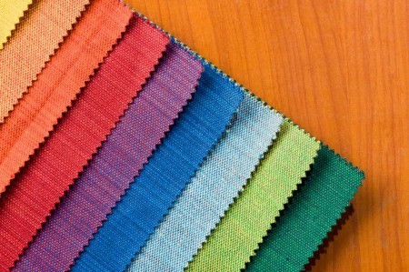
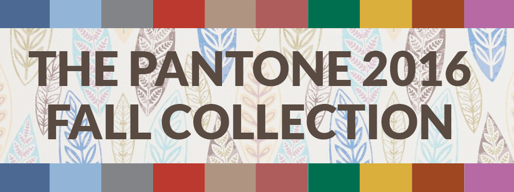
Leatrice Eiseman, Executive Director of the Pantone Color Institute, beautifully describes each color below, while we have provided coordinating upholstery fabrics for the Colors of Fall.
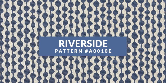
Earmarking the importance of Blue in the palette, the new blue shade of PANTONE 17¬-4028 Riverside undeniably takes precedence in the fall collections.
• Cool and calming, strong and stable
• Displays a subtle vibrancy and sophistication
• Borders on exciting, yet maintains a sense of constancy
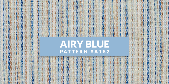
Pantone 14-4122 Airy Blue’s lofty nature evokes feelings of lightness and freedom.
• Designers seeking weightlessness in a world heavy with conflict
• Blue tones appear in nearly half of the designs
• Airy Blue nods to Serenity
• Pair Airy Blue with Lush Meadow, Taupe or Dusty Cedar for fresh approach
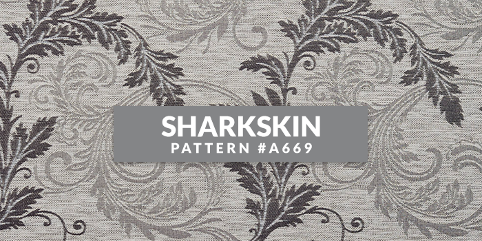
There’s an edge to PANTONE 17-3914 Sharkskin, and yet it manages to remain neutral.
• Pair-able with almost any fall color, bright or muted
• A color that the rest of the palette can literally and theoretically rest on
• Showcases practicality through a dependable but contemporary lens
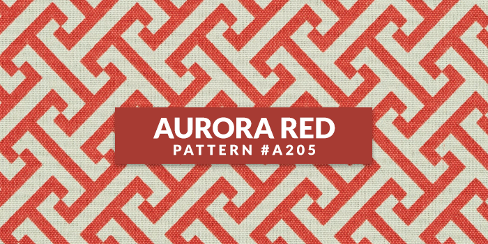
In contrast to the stable backbone of the Fall 2016 palette, PANTONE 18-1550 Aurora Red adds a welcome punch.
• A bold Red that is warm, sensual and immediately pleasing to the eye
• Gets the metaphorical blood of the palette pumping
• Exciting and dynamic, breeds unmistakable confidence
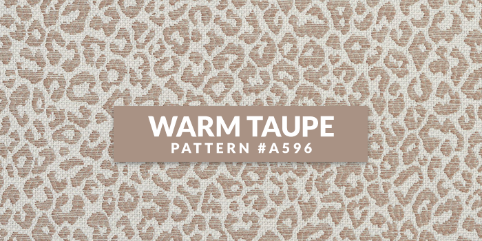
PANTONE 16-1318 Warm Taupe is a hearty, pleasing and approachable neutral that pairs well with each of the top 10 shades of the Fall 2016 season.
• Suggests reassurance and stability
• Trusted, organic and grounded
• Departs slightly from the foundations of the Fall 2016 palette
• Timeless
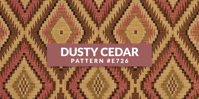
Like Airy Blue, PANTONE 18-1630 Dusty Cedar gives a nod to the PANTONE Color of the Year 2016, Rose Quartz.
• A fall and winter version of the Pinks we’re used to seeing in spring
• Dustier rose-toned Pink shade with some complexity
• Exudes warmth and welcome
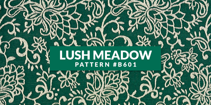
PANTONE 18-5845 Lush Meadow brings to mind fresh botanicals and foliage.
• Rich and elegant, vibrant and sophisticated
• This shade displays a brightness, panache and depth of color that elevates it from more natural greens
• Elevates the overall elegance woven through this season’s collections
Bounces elegantly off other colors in the palette,
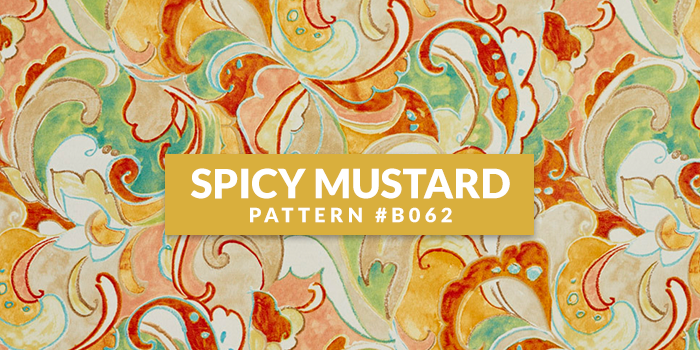
PANTONE 14-0952 Spicy Mustard is an exotic addition.
• Adds another splash of uplifting vibrancy
• A spicier, zestier Yellow than previous seasons
• Unexpected and unusual
• Comes through in both the abstract and geometric accents that designers employed
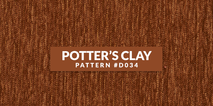
PANTONE 18-1340 Potter’s Clay has an added degree of sophistication and layering.
• Elements of russet Orange in its undertones, gives a grounded feeling that’s anything but flat
• Neutral earth tone; expected for fall and winter palette
• A shade with real substance; a strong foundation
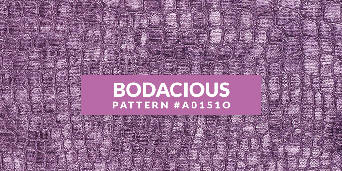
PANTONE 17-3240 Bodacious speaks to the gender fluidity we continue to see.
• Lends itself to vibrant color combinations
• Unexpected in fall
• Versatile; can be used with Pinks and Reds
• Bright, rich Purple, with hints of a more sophisticated Pink
• Turns fashion accents into fashion statements


